
LVRCH- Visual Identity & Creative Direction
OVERVIEW
LVRCH (pronounced "lurch") is an up-and-coming metal band that explores themes of rebirth, ritual, and emotional catharsis. They needed a bold and immersive visual identity that matched the raw intensity of their sound and lyrics.
I was brought on to lead the creative vision and execution across brand identity, merchandise, social rollout, and visual direction.
ROLE- CREATIVE Director & Visual Designer
I led the full branding process, from early concept development to visual rollout.
- Defined tone + visual language
- Built moodboards + brand system
- Designed custom logo + merch
- Directed social look/feel
- Shaped strategy for debut release
CONCEPT DEVELOPMENT
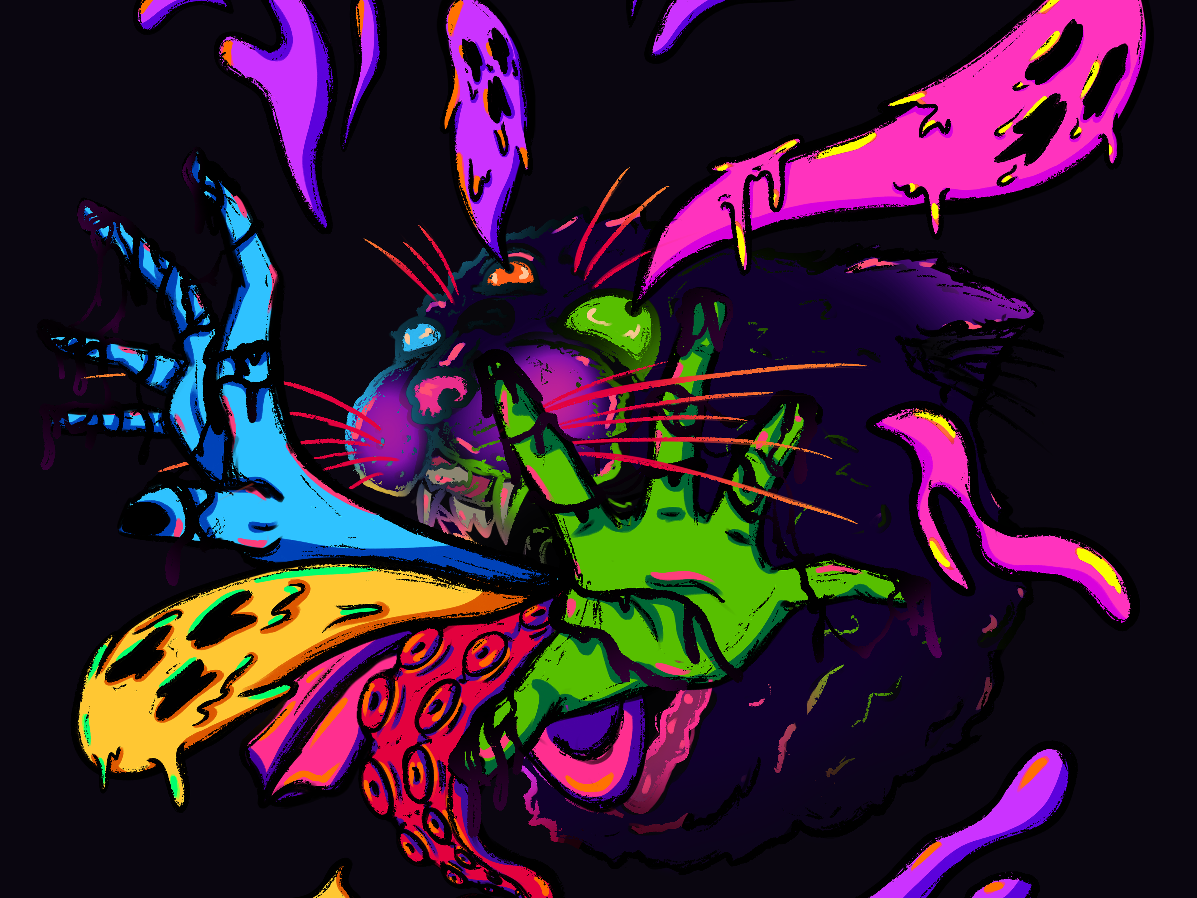
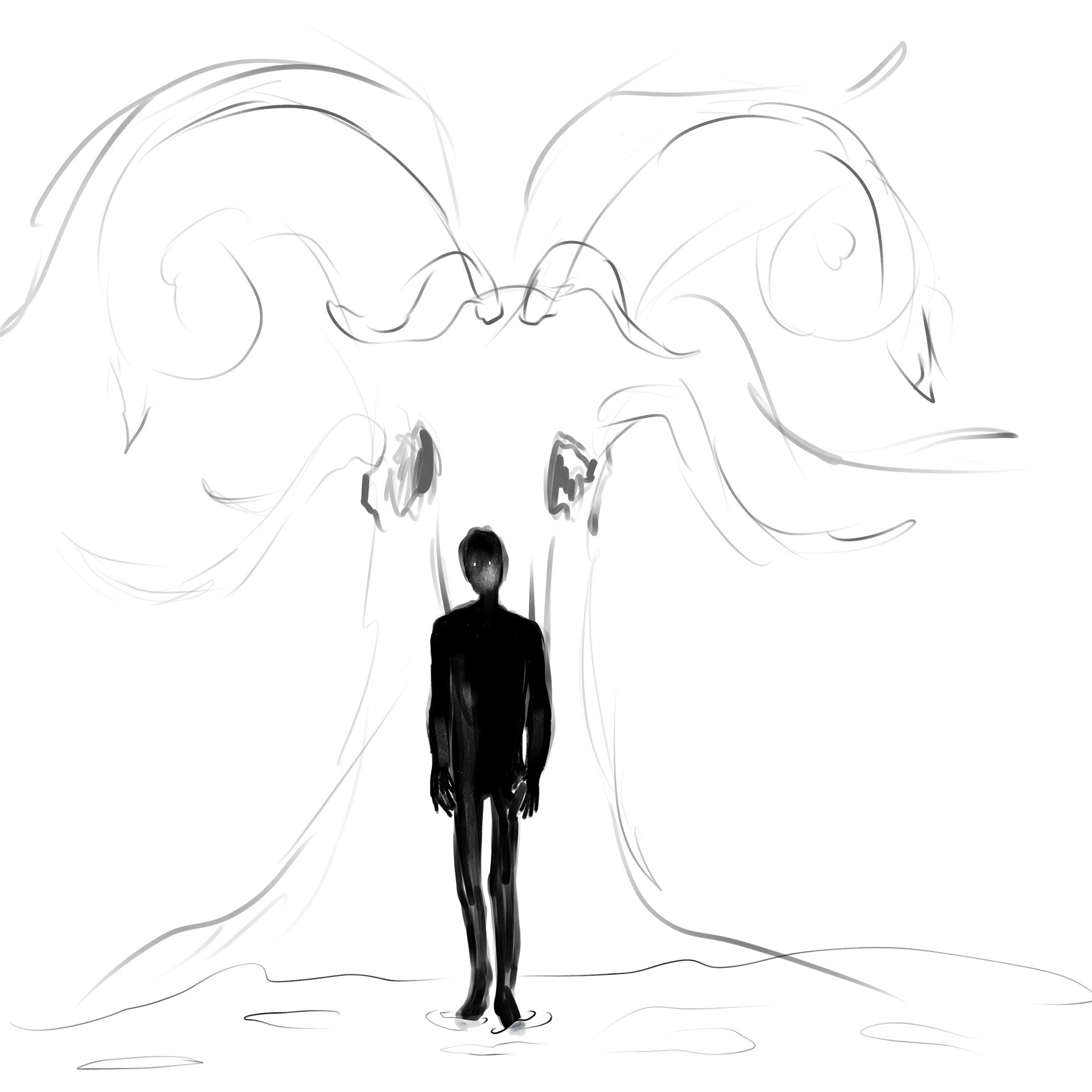
The name LVRCH, inspired by the vocalists love of the Addams family growing up, evokes a sense of unease, movement, and bodily tension, like a “lurch” forward. The band’s music speaks to personal collapse and transformation.
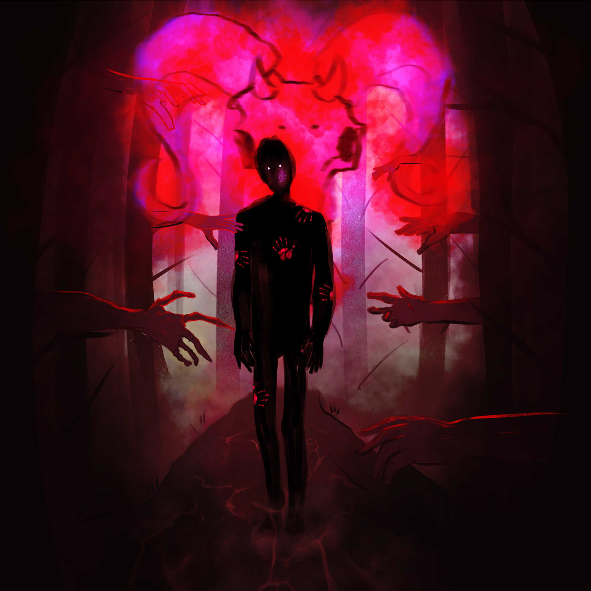
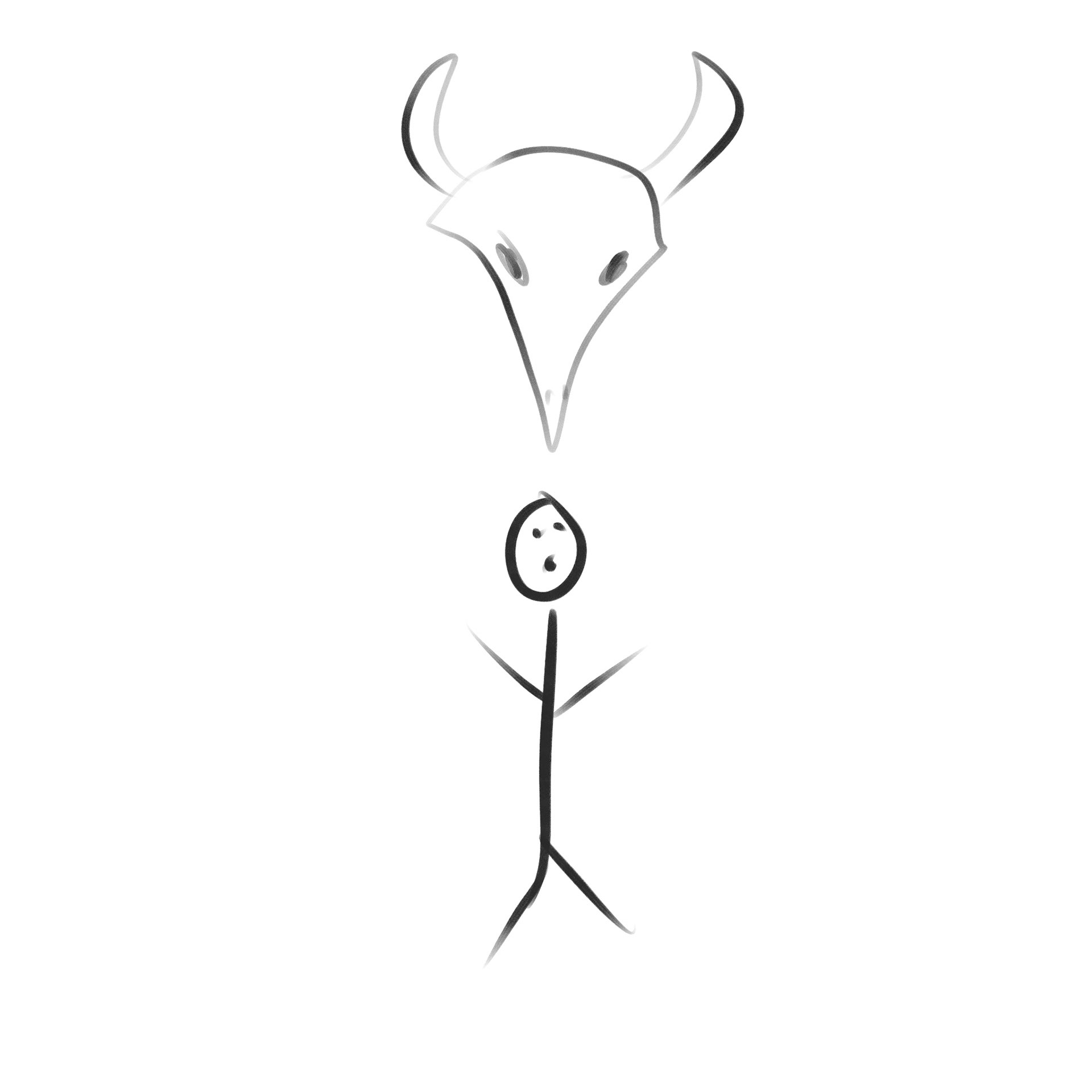
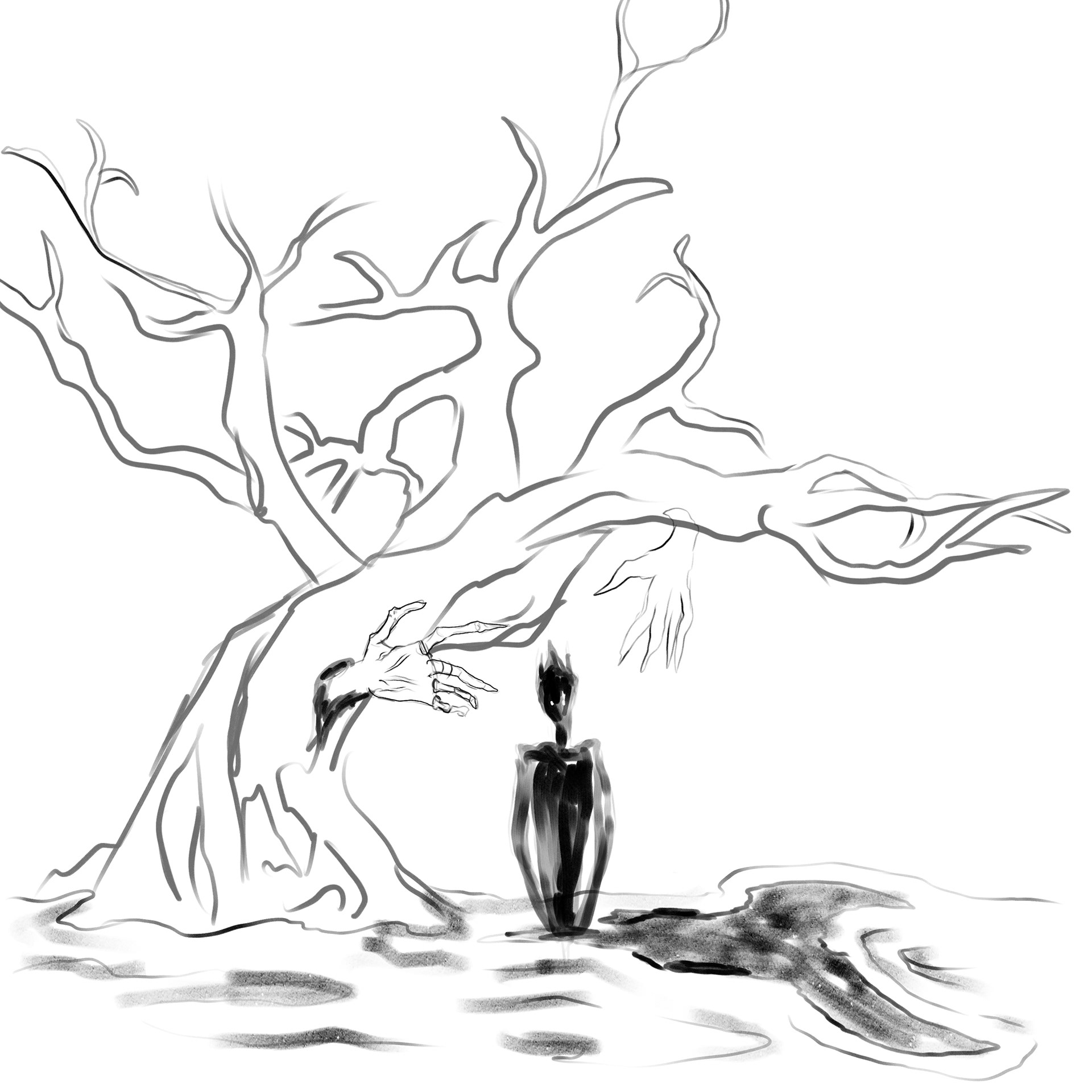
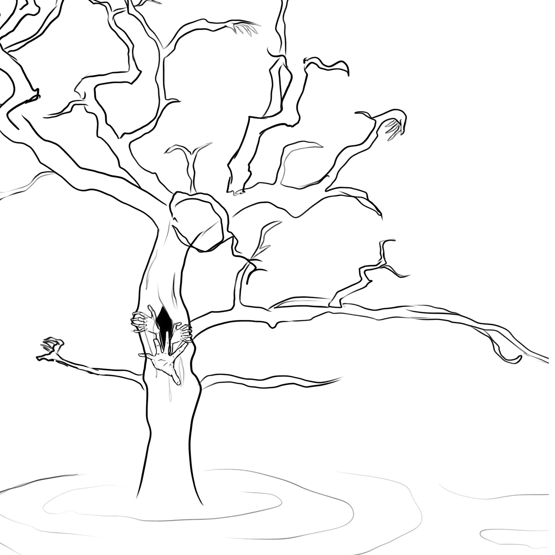
I leaned into old folklore and cryptid themes, Latin religious symbolism, and our shared love of horror. I wanted to evoke the feeling of something ancient being unearthed.
Moodboard snippets, early logo sketches, and type exploration formed the foundation of a ritualistic, gritty, yet deliberate visual system.
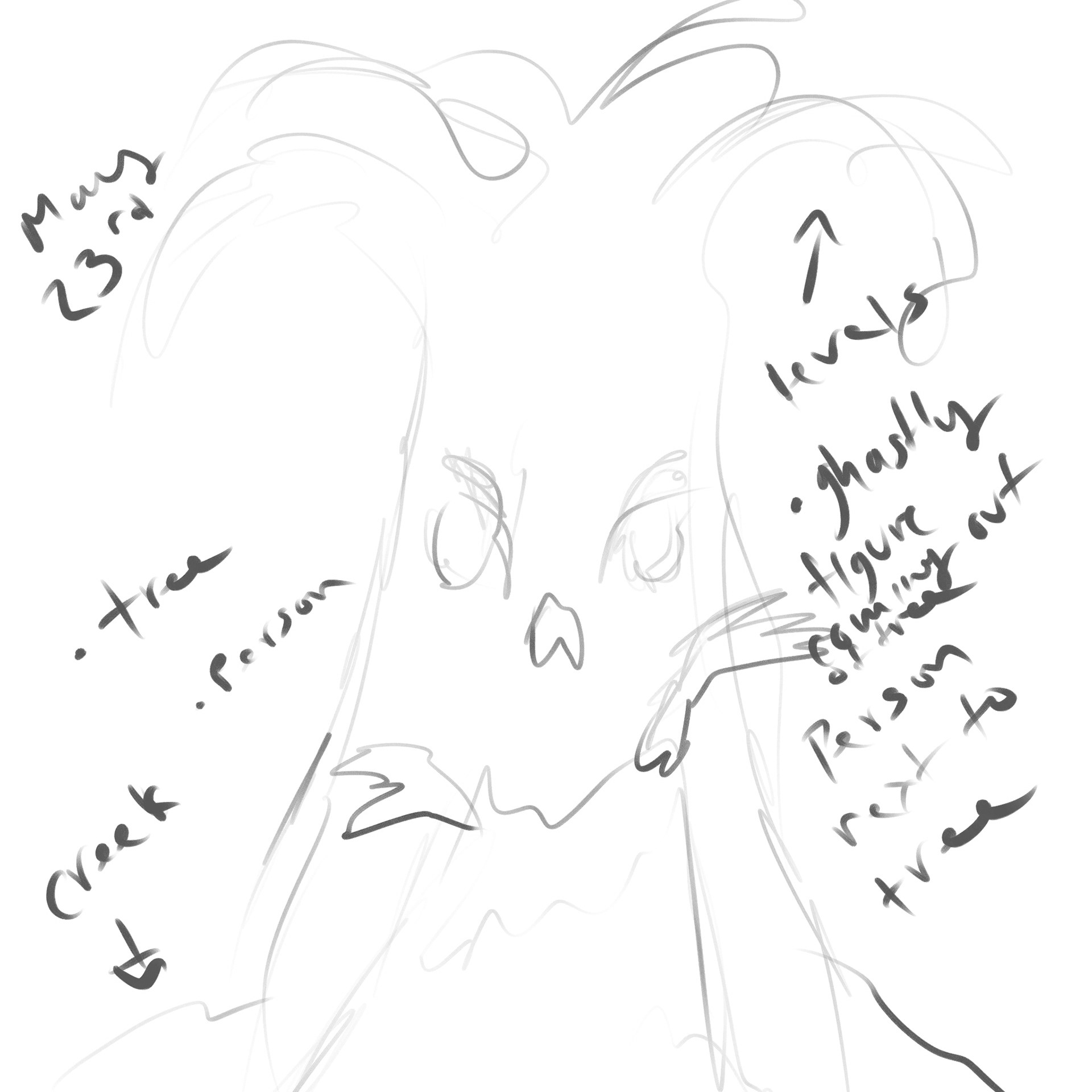
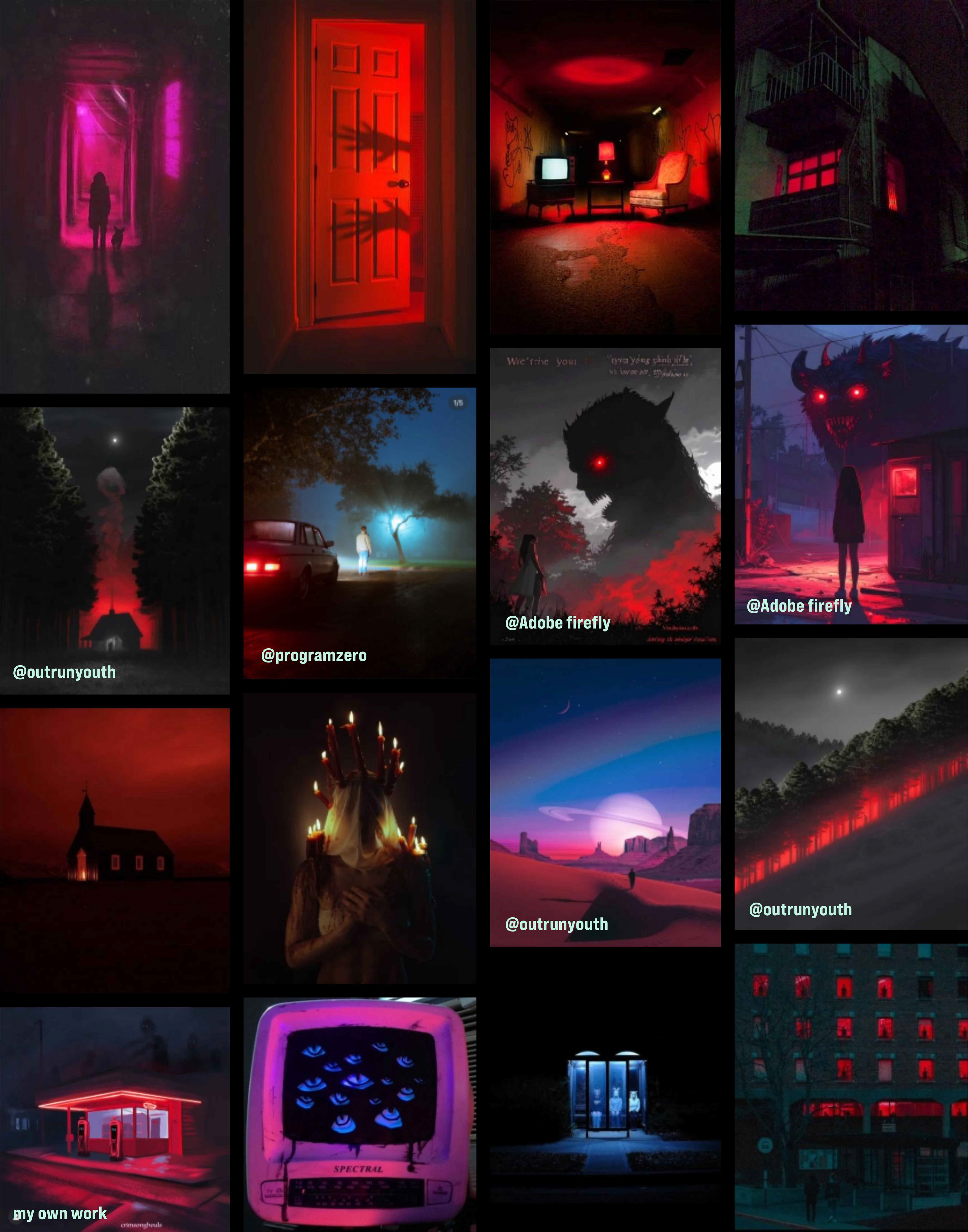
Images in moodboard not otherwise noted are from Pinterest.

Early logo iterations.
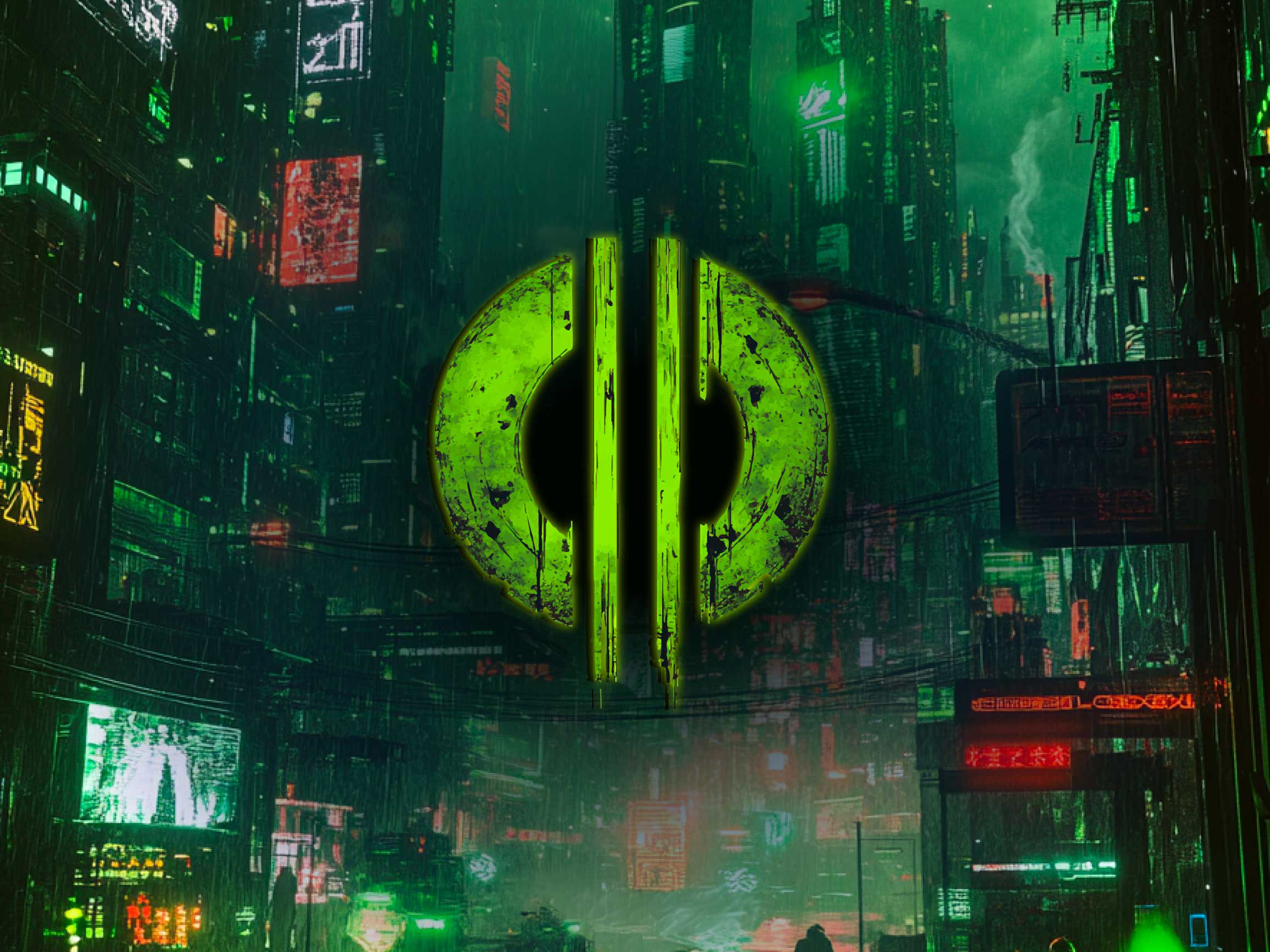
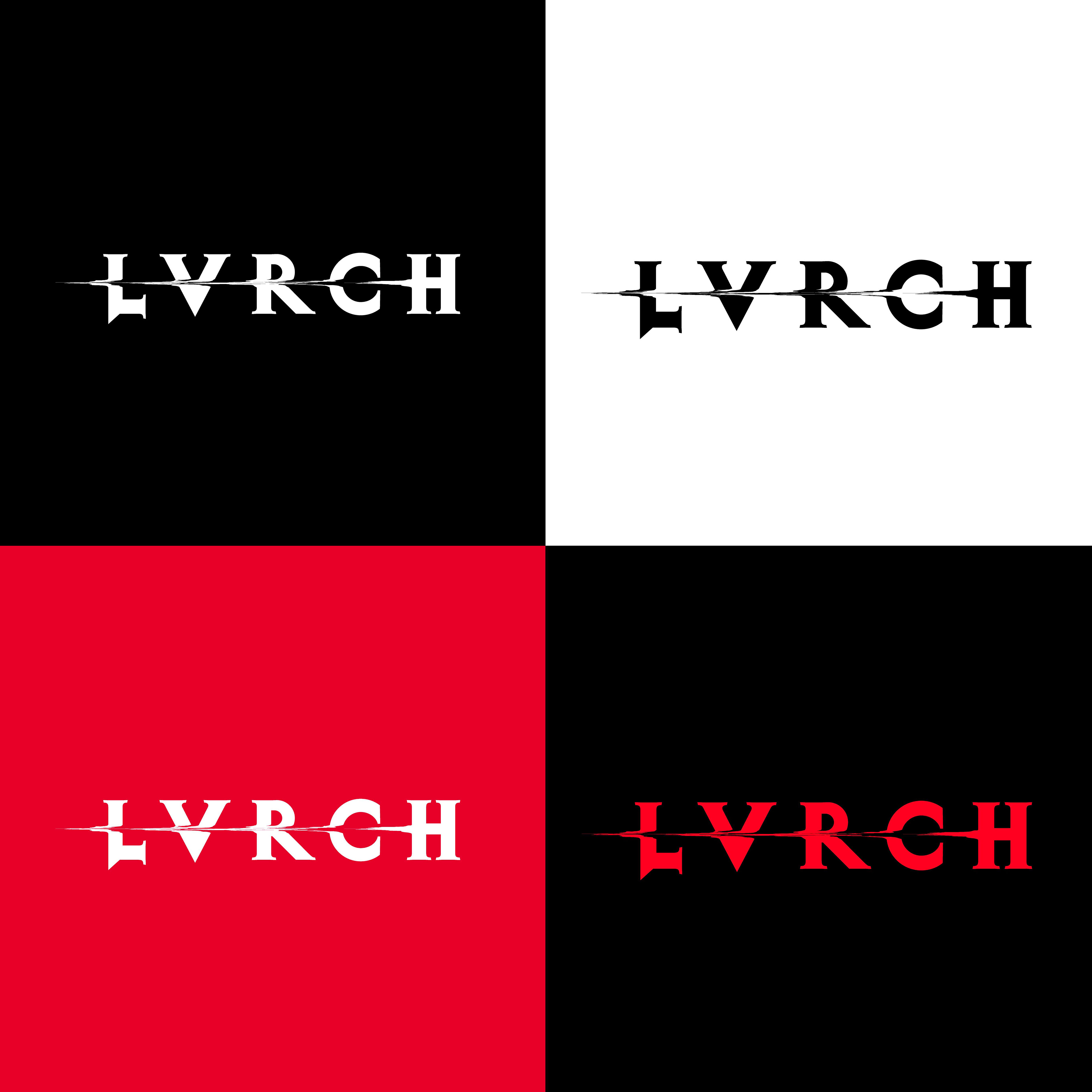
LOGO + IDENTITY SYSTEM
I built the logo while taking inspiration from jagged, altar-like forms. I referenced Latin type as well as traditional metal fonts when creating the logo. I wanted something special that mixed metal and modern fonts, that felt current as well as a bit unstable, a reflection of the band’s sonic energy. I went through many iterations to capture the gritty style the band represents.
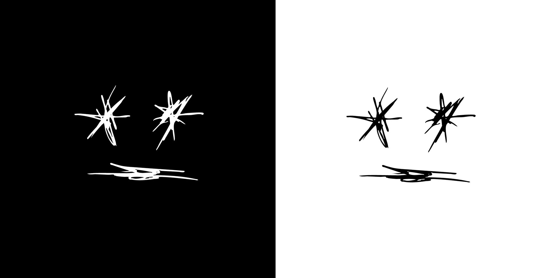
I also created a secondary image featuring a scribbled face to go along with the type.
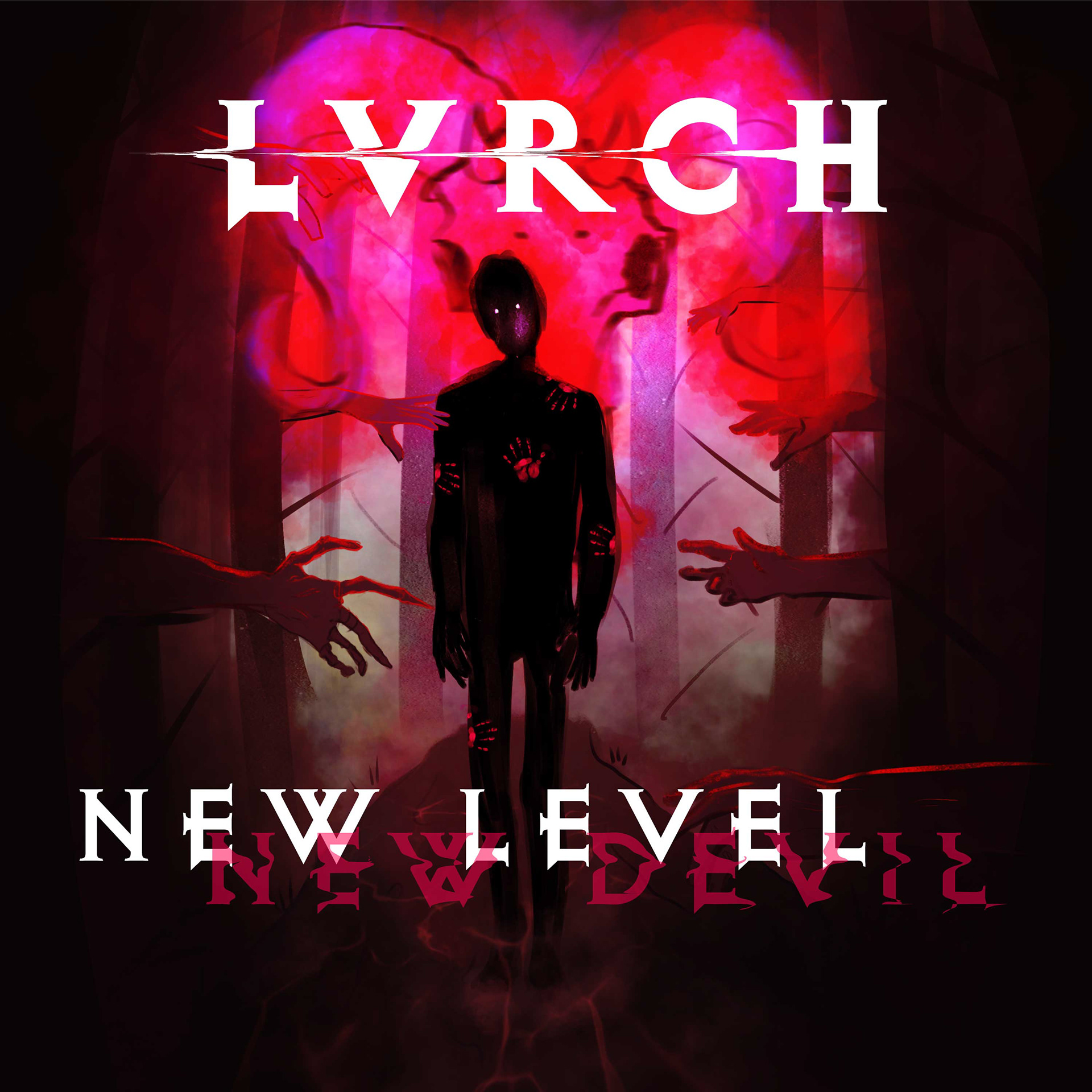
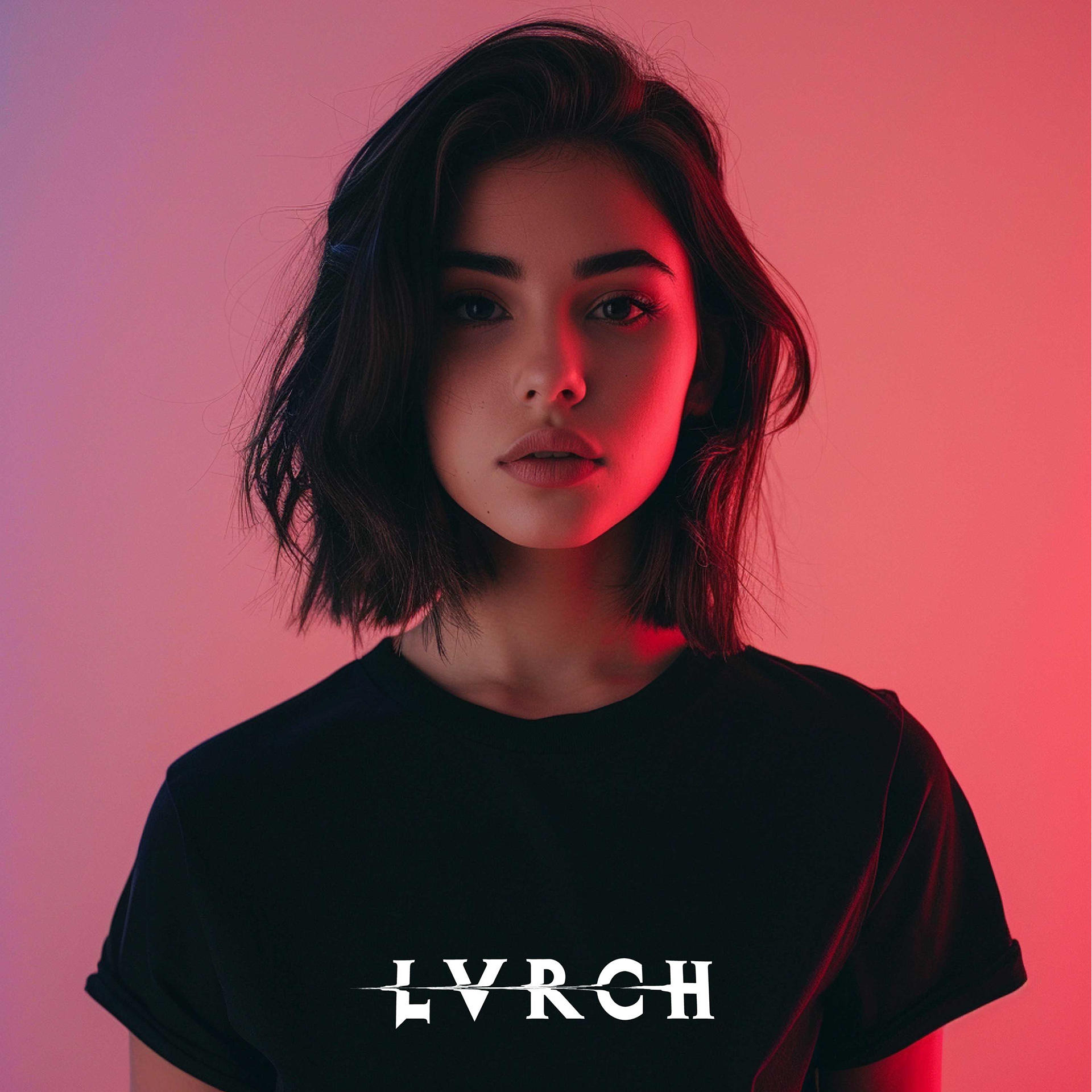
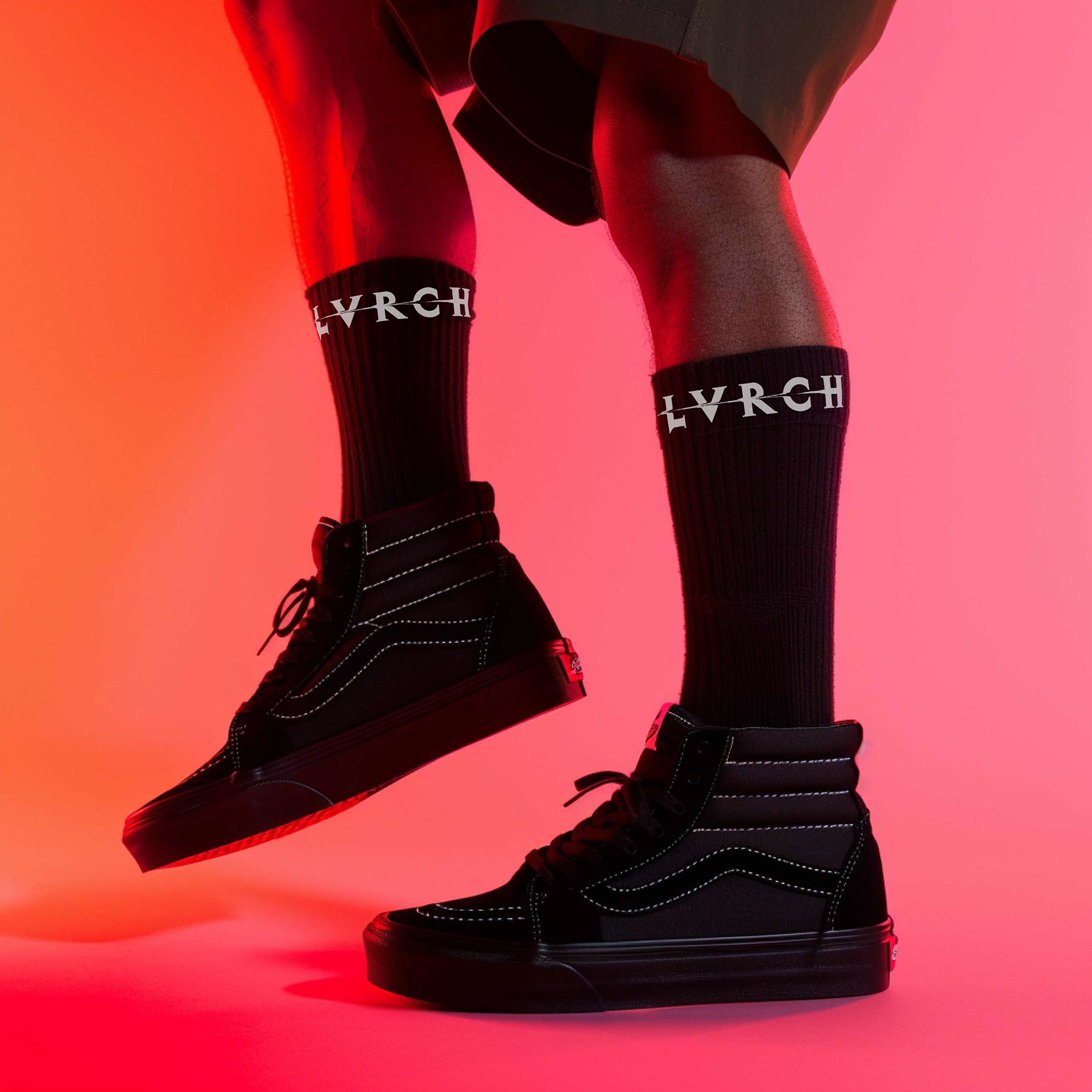
MERCH DESIGN
I’ve begun shaping a merchandise line for the band, kicking it off with a sleek, straightforward use of the logo. I have future ideas that will feature recurring characters/creatures, strong monochrome contrast, and distressed textures. Any visual relating to the band (whether merch, album art, etc.) tells part of the band’s story.
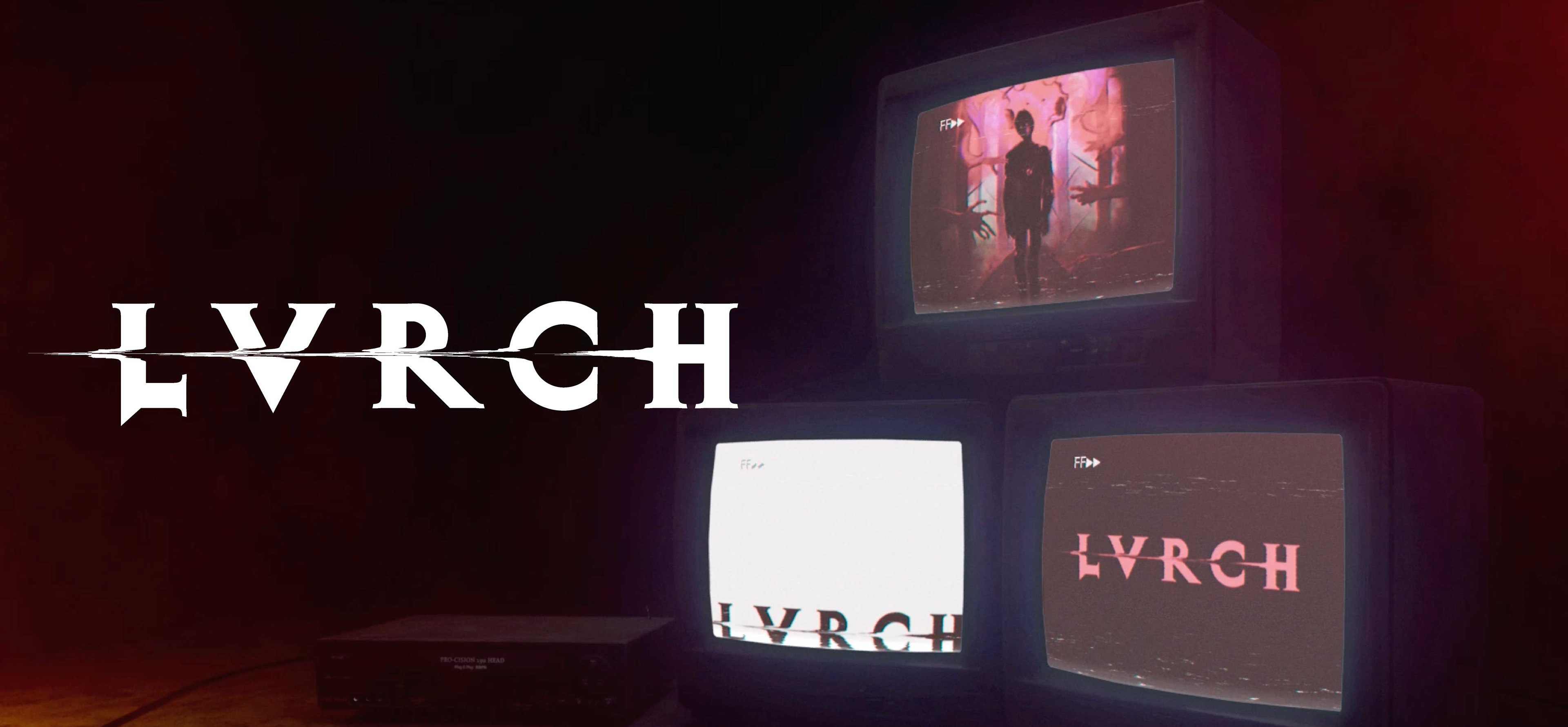
SOCIAL LAUNCH & PROMO
To support the band’s first release, I designed visuals for launch on social media, as well as a final music video for their first song. I focused on dynamic movements, contrast with strong shadow and neon lighting, and asymmetry.